Planning a modern wedding involves paying attention to every detail, including your Facebook cover photo. As the first impression of your wedding to your online guests, a well-designed cover photo can create a lasting impact.
I will walk you through the steps of designing an elegant Facebook cover photo for your modern wedding so your big day stands out.
Choosing a theme that suits your modern wedding aesthetic
To begin, select a theme that aligns with the overall aesthetic of your modern wedding. Whether it’s a minimalist and clean look or a bold and vibrant color palette, the theme sets the tone for your cover photo. For example, if you use gold in your wedding then consider elements like foil geometric patterns or subtle yellow backgrounds that reflect your unique style.
Finding or capturing the perfect image for your cover photo
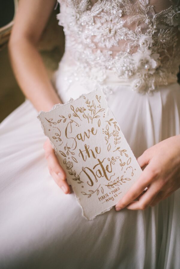
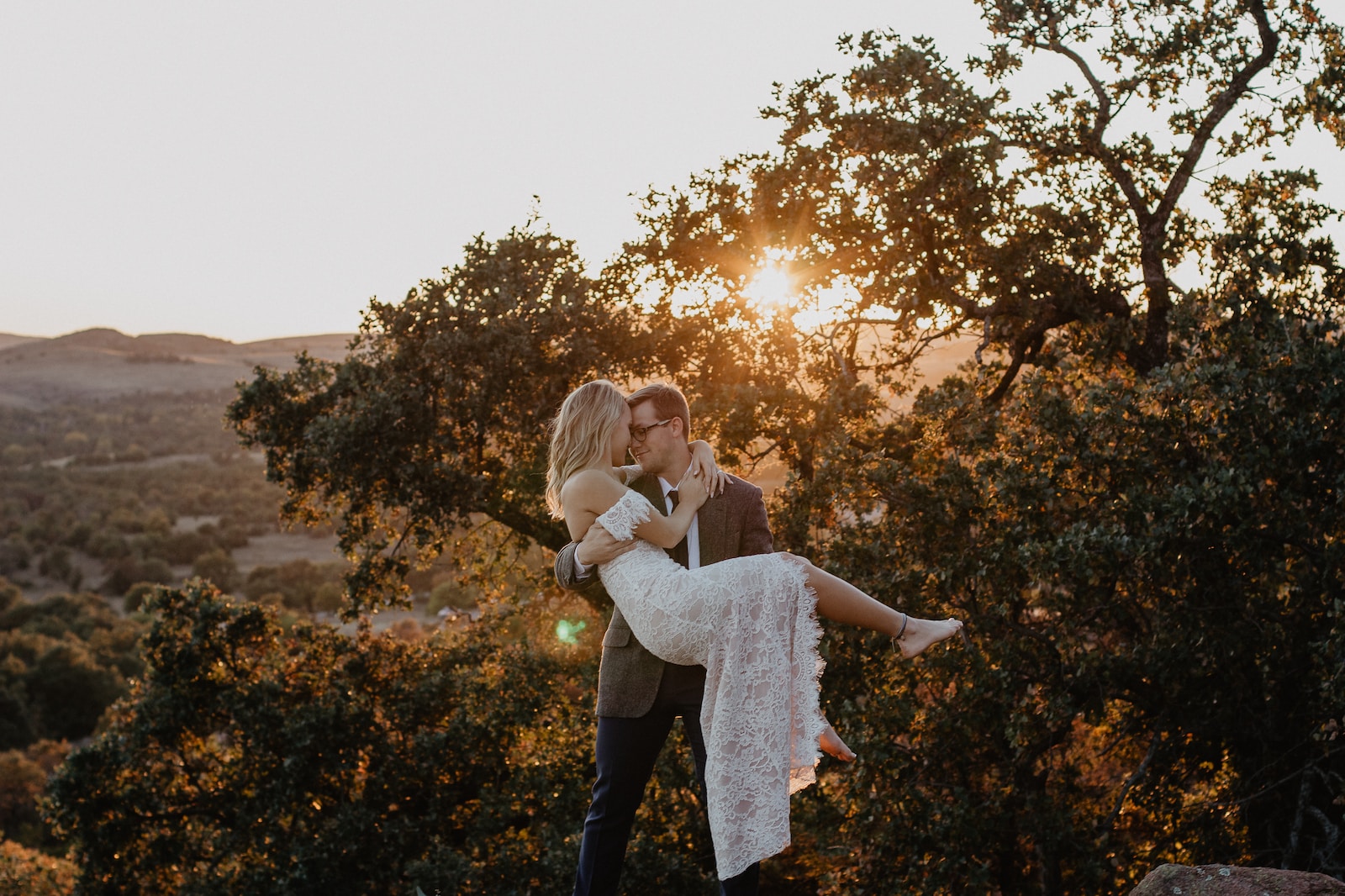
Next, find or capture the perfect image that represents your wedding theme. You can browse through stock photo websites or hire a professional photographer for a personalized touch. Look for images that evoke emotions and showcase the essence of your modern wedding, such as a couple embracing under a stunning sunset or a close-up shot of your beautifully designed wedding invitations.
Adding text and typography to convey your message
Once you have your image, it’s time to add text and typography to convey your message. Try to avoid some of these common web design mistakes so your photo is crisp and your text is clear. You can use Adobe Express to experiment with different fonts, sizes, and placements. Consider including your names, wedding date, or heartfelt quotes that resonate with your love story. Ensure that the text is legible and complements the overall design of your cover photo.
Editing and enhancing the image for a polished look
To achieve a polished and cohesive look, edit and enhance the image using photo editing tools. Adjust the brightness, contrast, and saturation to create a visually appealing composition. Experiment with filters or color grading techniques to enhance the colors and mood of the photo. Remember to maintain the integrity of the image while enhancing its visual appeal.
Optimize for Facebook Dimensions and Guidelines
When designing a Facebook cover photo for your modern wedding, it’s essential to optimize it to fit the platform’s dimensions and guidelines. This ensures that your cover photo looks great and is displayed correctly on desktop and mobile devices. Here are the steps to follow:
Understanding the recommended dimensions and file size
To start, you need to know the recommended dimensions for a Facebook cover photo. The ideal size is 820 pixels wide by 360 pixels tall. This aspect ratio ensures that your cover photo will look great on most devices. Additionally, Facebook recommends keeping the file size below 100 kilobytes to ensure fast loading times.
Ensuring your design meets Facebook’s cover photo guidelines
Facebook has specific guidelines in place to ensure that cover photos are visually appealing and comply with their terms of service. Some important guidelines to keep in mind include:
- Your cover photo cannot include contact information, such as website addresses or phone numbers.
- It should not be misleading or infringe on anyone else’s rights.
- It cannot include price or purchase information, such as discounts or offers.
- Your cover photo should not be overly text-heavy, as Facebook prefers visuals over text. The text should cover no more than 20% of the image. Whether you are designing the cover yourself or working with a professional designer, it’s crucial to ensure that your design meets these guidelines.
By optimizing your Facebook cover photo to fit the recommended dimensions and guidelines, you can create an elegant and visually stunning design that represents your modern wedding.
 Test and Adjust
Once you’ve designed your Facebook cover photo for your modern wedding, it’s important to test and adjust it to ensure it looks elegant and appealing on different devices. This step will help you identify any issues and make the necessary adjustments for an optimal viewing experience.
Previewing the cover photo on different devices
Start by viewing: your cover photo on various devices such as desktop computers, laptops, tablets, and smartphones. This will give you an idea of how it appears across different screen sizes and resolutions. Take note of any elements that are cut off, distorted, or appear differently than intended.
Check for: any readability issues with text or graphics, as well as any color discrepancies. Make sure your cover photo stands out and is visually appealing on all devices.
Making necessary adjustments for optimal viewing experience
Based on your observations: make the necessary adjustments to ensure your cover photo looks elegant and visually consistent across all devices. Consider resizing, repositioning, or tweaking elements to maintain the overall aesthetic.
Pay attention to the dimensions recommended by Facebook for cover photos, which are currently 851 pixels wide and 315 pixels tall. Ensure that crucial elements of your design are within the safe zone, which is the center 640-pixel width and the area not covered by the profile picture.
Remember to regularly test your cover photo on different devices. As technology advances, new devices with varying screen sizes and resolutions may emerge, so it’s crucial to keep your design adaptable.
By following these steps and continuously testing and adjusting your cover photo, you can create an elegant and visually appealing design that captures the essence of your modern wedding and leaves a lasting impression on your Facebook audience.

